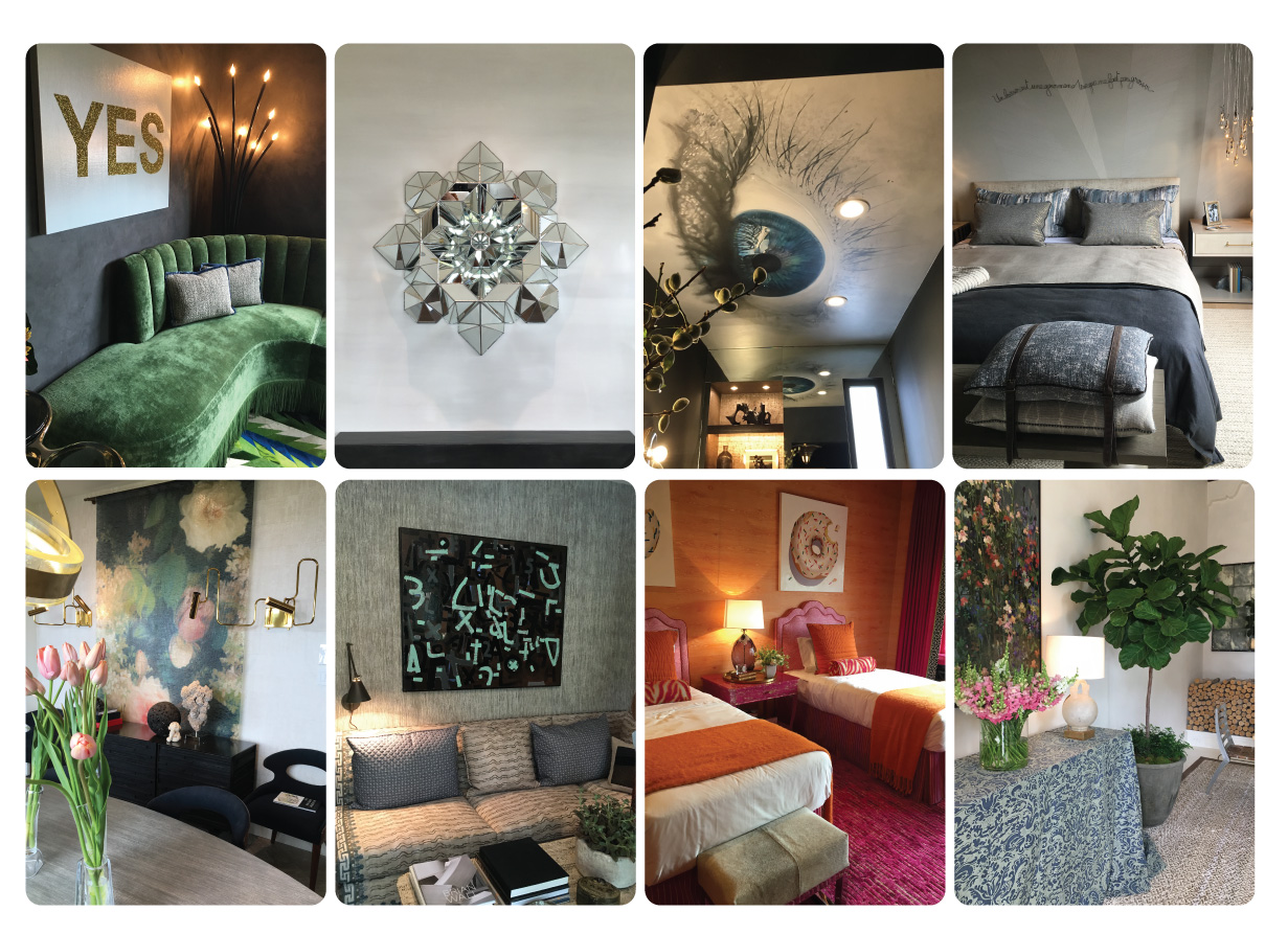
San Francisco Decorator Showcase 2016
Last week, the 2016 San Francisco Decorator Showcase came to an end. If you didn’t have a chance to check it out, or simply want another look, you’re in luck- this post revisits our favorite spaces. We explore our top 3 decorating trends from the showcase and offer tips on recreating the look the elworthy studio way.
From left to right | Front bedroom designed by Ann Lowengart | Upper level bar designed by Linda Sullivan (image by popsugar) | Upper level study designed by Ian Stallings | Powder room designed by Elizabeth Martin
1. Clever use of wallpaper
Wallpaper was in abundance at the Showcase, and not just on walls! Looking to add an element of surprise to a room? Try wallpapering your ceiling! We often overlook ceilings when really we should see them as a 5th wall and a backdrop for a show stopping light fixture. In their downstairs powder room, Martin Group Interiors incorporated a photographic eye image on the ceiling; such a creative way of adding wow factor to a small space! Sullivan Design Studio broke up a long, plain hallway with a striking wallpapered bar area. We loved how they created a compelling space where there wasn’t one before, and, let’s be honest, everybody needs a bar in their upstairs hallway!
From left to right | Sitting room designed by Nancy Evars & Dimitra Anderson | Dining room/kitchen designed by Martin Kobus | Main floor study designed by Stephan Jones | Master Bedroom designed by Tineke Triggs
2. Texture love
Layering textures can elevate rooms from ho-hum to irresistibly inviting and sumptuously comfortable, and the Showcase interior designers embraced this technique! Our favorite was the YES sitting room designed by Evars + Anderson- truly a texture heaven with dark chalky walls, a plush green velvet sofa (with fringe!) and a quirky striped cow hide rug. To recreate this look, try starting with textured wallpaper like grasscloth or an oversized painting, layer in some luxurious velvet curtains or upholstery, then top it off with some patterned throw pillows and a cozy knit throw blanket.
From left to right | Main floor study designed by Stephan Jones | Walk in closet designed by Nanette Gordon | Garden room designed by Heather Hilliard | Front bedroom designed by Ann Lowengart
3. Pattern play
Mix and matching patterns is another great way to achieve a rich, layered space that looks effortless (but is actually quite simple). We were obsessed with the study created by Stephan Jones. He used an enticing palette of neutrals and indigo blues paired with contemporary artwork and antiques to create a visually compelling yet relaxing retreat that made us want to linger. What makes his pattern play work is the use of a variety of printed textiles that are consistent in palette but varied in scale. To master your own pattern play, try pairing our Patina design with Totem and Sepia, and accessorize with brass fixtures and earthy decor, such as crystals or driftwood.
Don’t hesitate to get in touch if you would like more information on the products mentioned. Also, follow us out on Instagram for a daily dose of interior inspiration!


