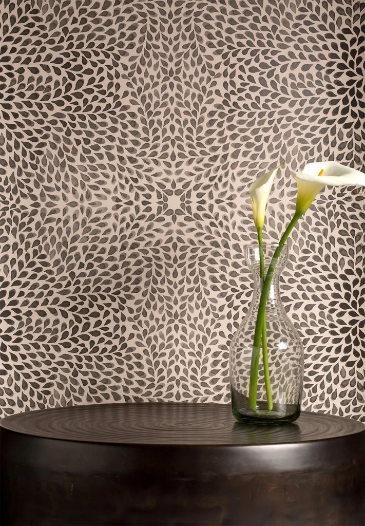
Behind the design: Alhambra
Photo: Gina B Photography
We launched Alhambra as part of the Native Collection last year, and it has quickly become one of your favorites! The wallpaper version was recently spotted in San Francisco Design Center’s new glossy, HENRY. In her letter from the editor, EIC Alisa Carroll stated that Alhambra reminds her of an “enduringly elegant” patterned wall covering she spotted at Maison de Victor Hugo in Paris. I’m honored and humbled by the comparison and hope that Alhambra also proves to be enduringly elegant!
Inspiration:
Like all the Native Collection designs, Alhambra took inspiration from my local coastal landscape. On my daily walks, I admired the cascading ice plant succulents that cover the ground of the beachside cliffs. I loved the way these plants seemed to grow in all directions and wanted to create a design that evoked that sense of movement.
Photo: Alan Majchrowicz (left), Gina B Photography (center, right)
Process:
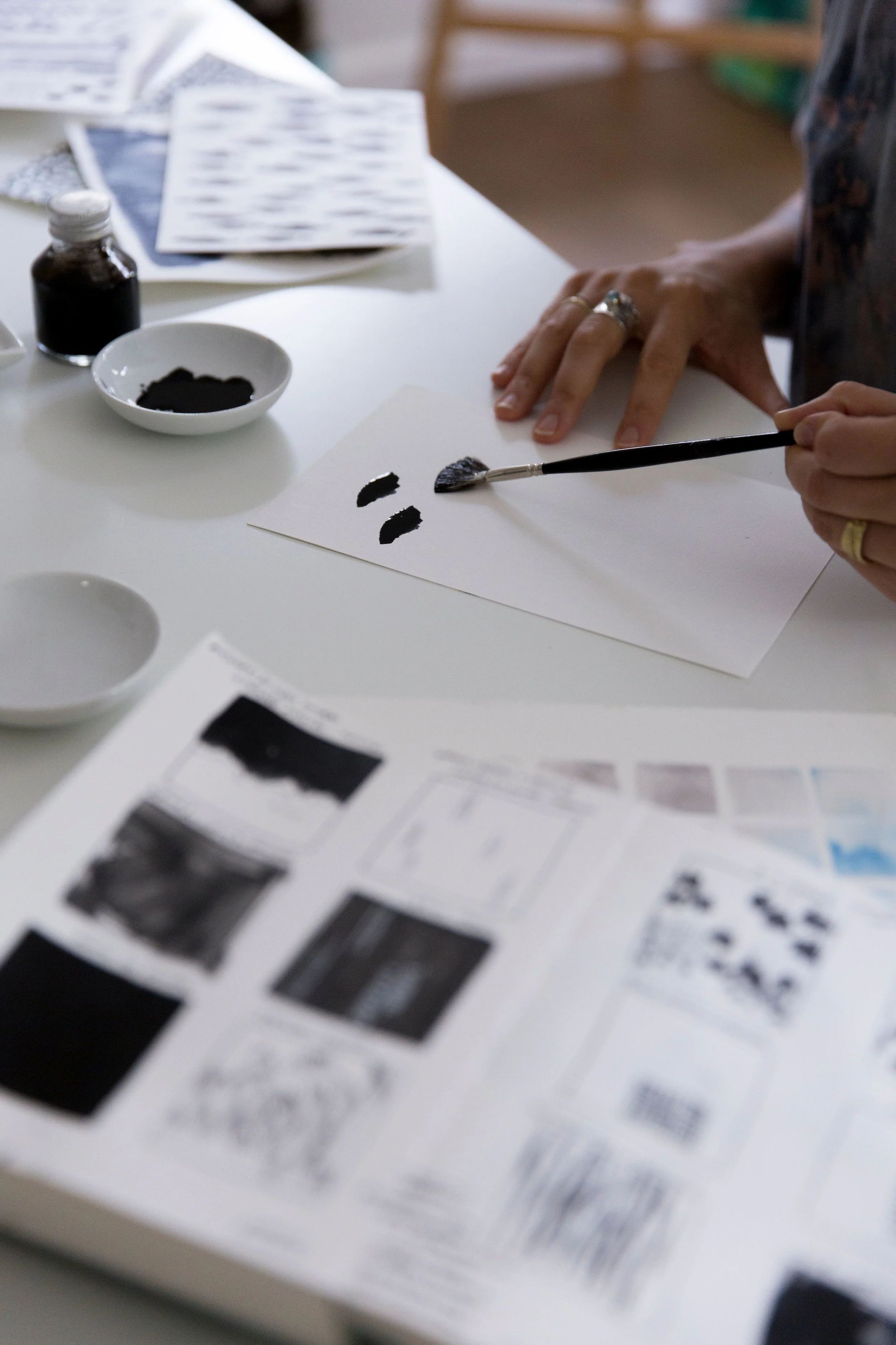
This design started as a rough sketch of overlapping petal shapes and was one of the design concepts I used on a set of infant flash cards I made for Laila when she was born. This was one of her favorite cards, so I knew there was something visually compelling about it!
I decided I wanted to go in a direction that was softer and more abstract, which led me to the brushed teardrop shape. Using ink and watercolor in shades of black, gray, and blue, I created a series of paintings. I mixed colors as I painted and discovered some wonderfully rich inky blues in the process. I just let my intuition guide my brush, and changed direction of my painting when it felt right to do so.
I tried repeating the artwork in a few ways, but loved the effect of a mirror image repeat best. It reminded me of a tiled mosaic and seemed like the perfect way to give a very organic design some structure and balance.
In situ:
Designer Briana Nix used Alhambra wallpaper (in the white colorway) for a recent San Francisco project. We asked her to share a bit about the space, and why she and the client chose Alhambra.
“This room is very small with only enough space for a bed, rug and lighting. I wanted the space to be impactful since the furniture would be sparse, and an accent wall with bold wallpaper was a natural choice.
Photo: Sean Poreda
Her client had a collection of ethnic furnishings from extensive travel and living abroad, so Briana wanted a print with a nod towards the exotic that would complement the rest of the home. “Alhambra was a perfect fit with the organic and natural feel of the headboard and the clients fell in love with it at first sight”.
Mission accomplished? Nix is happy to report that Alhambra wallpaper “gives subtle depth to the room which is what we needed for such a small space—the movement in the design tricks your eye into thinking the room is bigger than it is”.
Thanks so much to Briana for sharing these photos and your thoughts!
•••
We love seeing installation photos and hearing from you. If you have photos and feedback to share, please email it to info@elworthystudio.com.


